Alarm.com
Marketing Collateral
In my years at Alarm.com, I was able to shape and strengthen the visual design and brand presence of our various marketing materials for both Alarm.com and its partners.


My first direction coming on board was bringing a friendlier feel to Alarm.com’s marketing materials that could frequently be tech- and text-heavy.
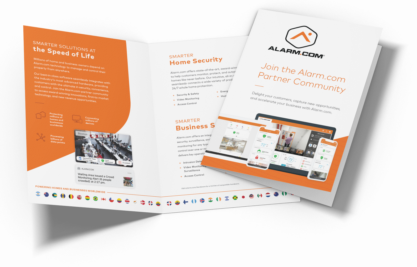
By using the shield shape within Alarm.com’s logo, we had a more fluid shape for masking photos and color blocks. The shape allowed for better layering of necessary UI and product elements throughout the pieces.

Over time, the shield shape became more difficult to work with in certain formats, as well as something we and our partners had seen used over and over.
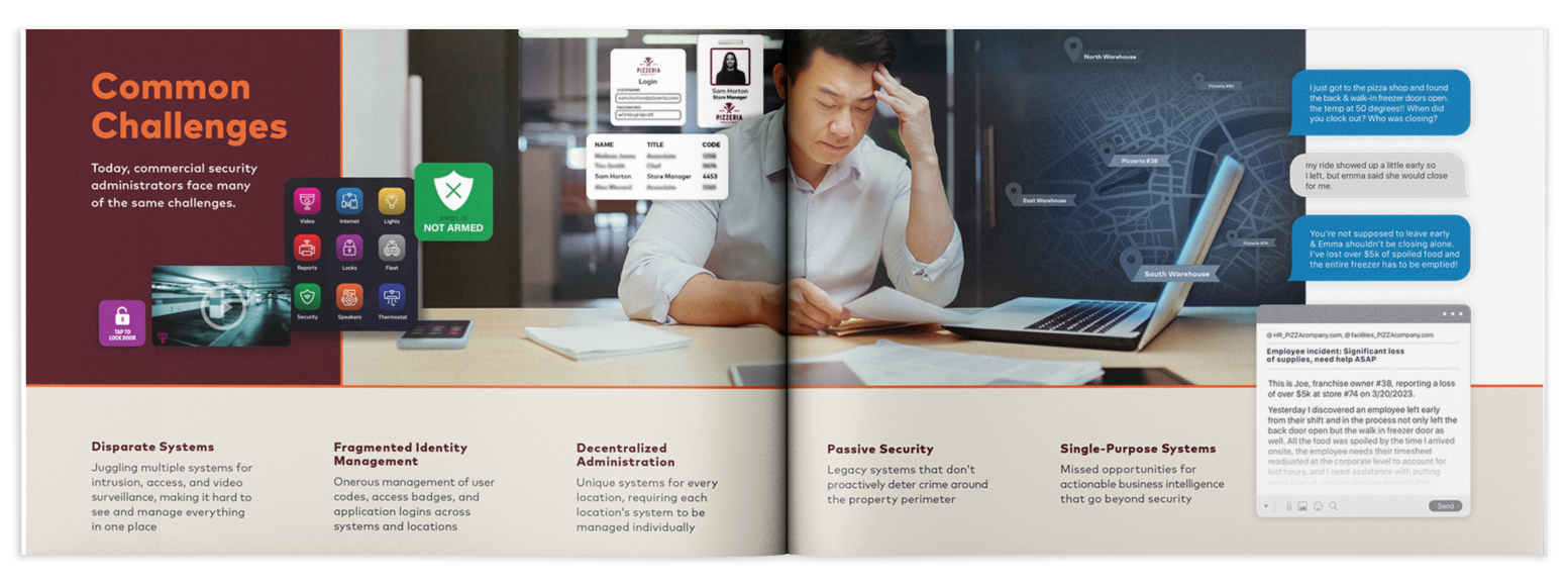
For core content, text had become overly heavy, and inconsistent from piece-to-piece. Restructuring the key features sections and how we formatted product and UI allowed for better focus on the product or feature at-hand.
A stricter grid system, bolder colors, and direction toward stronger typography helped upgrade to cleaner, more-focused summaries.

The refreshed colors and grid system have expanded to all marketing collateral and has helped better segment products and services among verticals, while still allowing for flexibility in design layouts.